Inside the Craft of Zelt: Web Design by Cuberto
Cuberto crafts an agile web design system for Zelt, uniting modular data architecture, Noi Grotesk typography, and fluid motion.
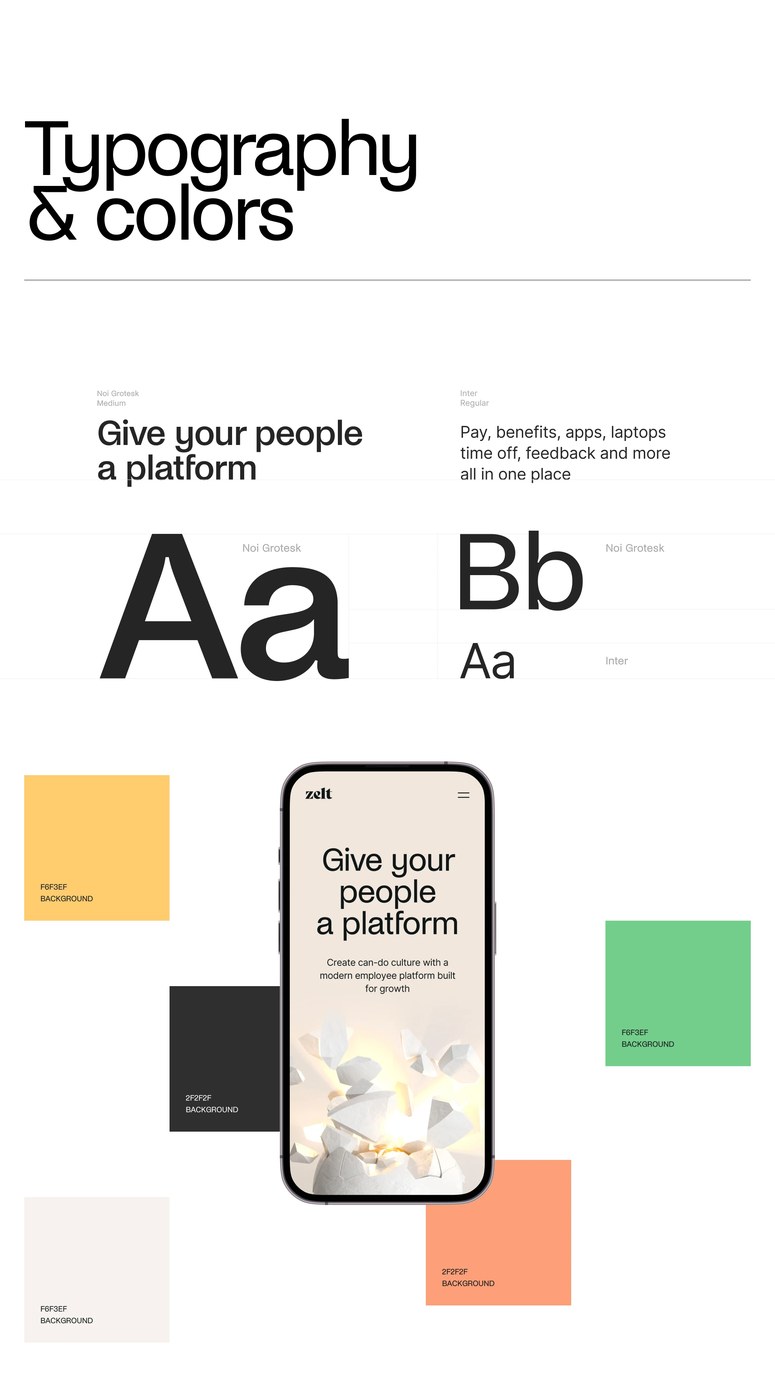
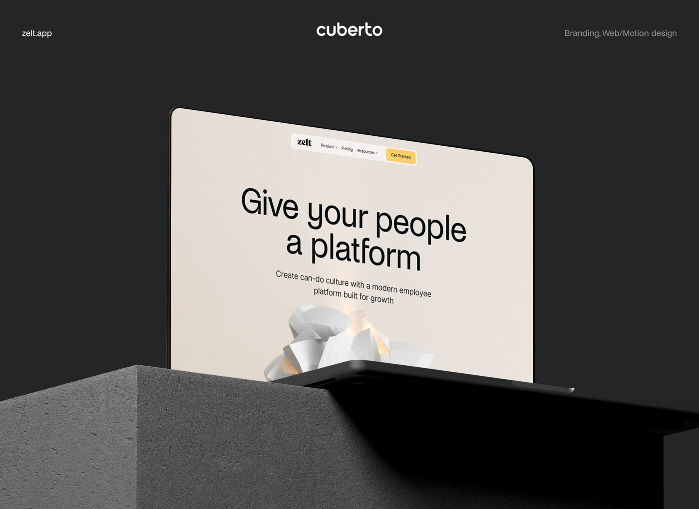
Modern business tools often struggle to present dense workflows with clarity. For Zelt, a platform uniting HR, IT, and payroll for fast-growing startups, design agency Cuberto built a fresh digital experience. The concept balances practical clarity with tactile physical metaphors. Warm bone-white canvases (#F6F3EF) meet deep charcoal panels (#2F2F2F). On the landing page, an organic stone cluster glows with warm light. Floating pill navigation bars, crisp hairline rules, and amber button accents guide user focus. Dark-mode cards sit next to pale content blocks to create instant depth. These choices prove that business tools can feel lively and refined rather than cold.
Modular Grid Architecture in Web Design
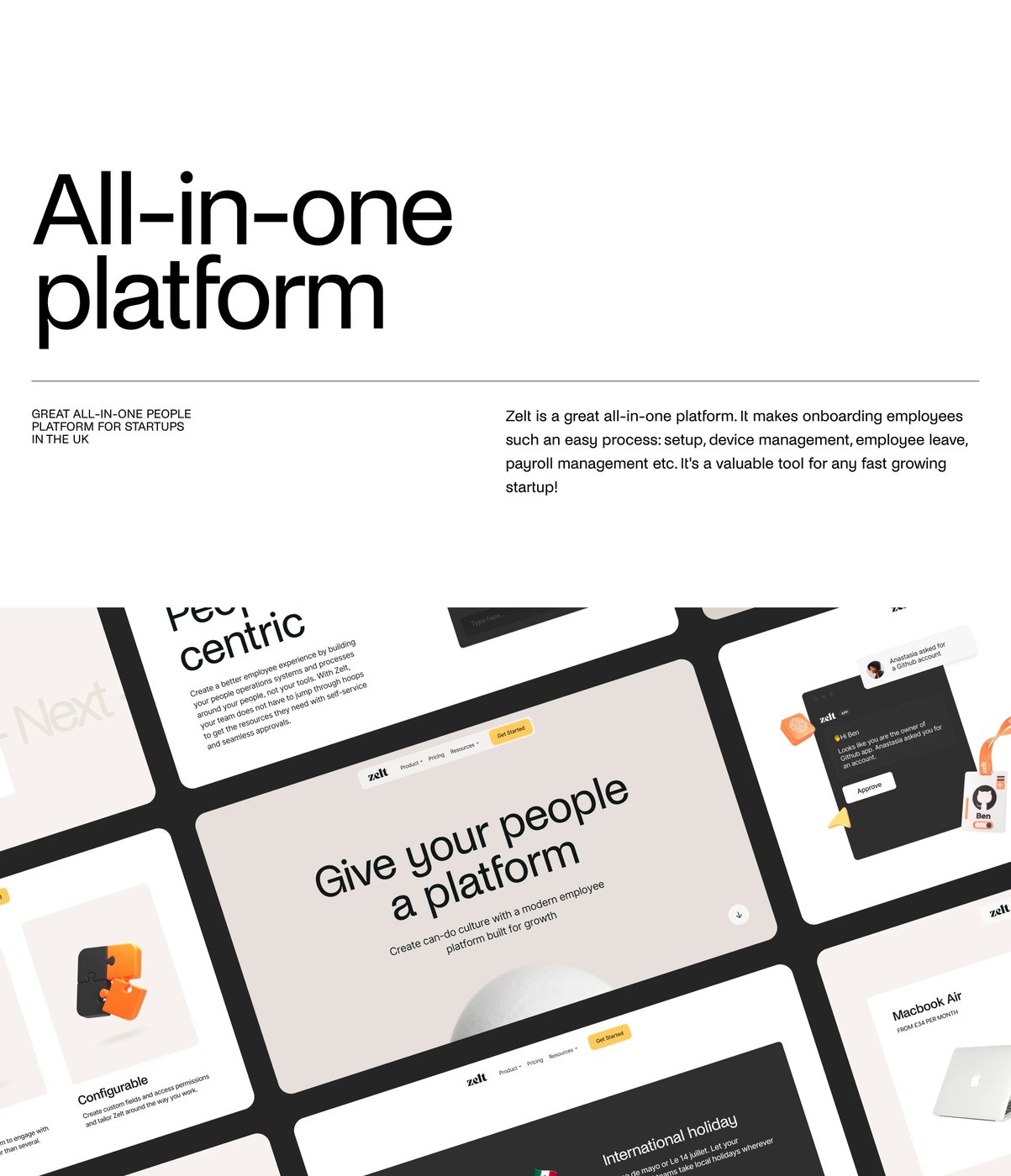
At the core of this web design is a clean type system. Cuberto chose Noi Grotesk Medium for display headlines and Inter Regular for dense interface data. Large grotesque headers establish strong visual weight across desktop screens. Compact, letter-spaced metadata clarifies daily tasks like team payroll and hardware setup. Cuberto sorts features into responsive modular cards. Hairline rules separate each data block cleanly. Every component aligns strictly with an underlying grid. On mobile screens, the multi-column layout collapses smoothly into a single-column flow. Users can parse team requests, GitHub account permissions, and Apple MacBook Air fleet orders without friction.
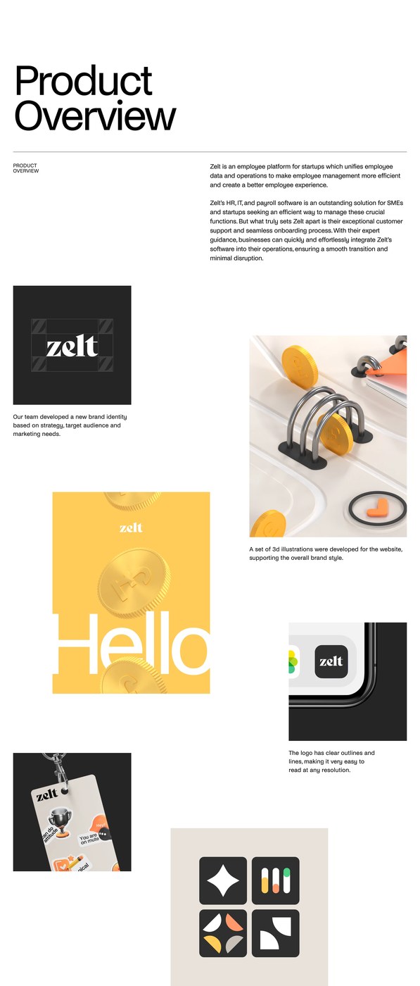
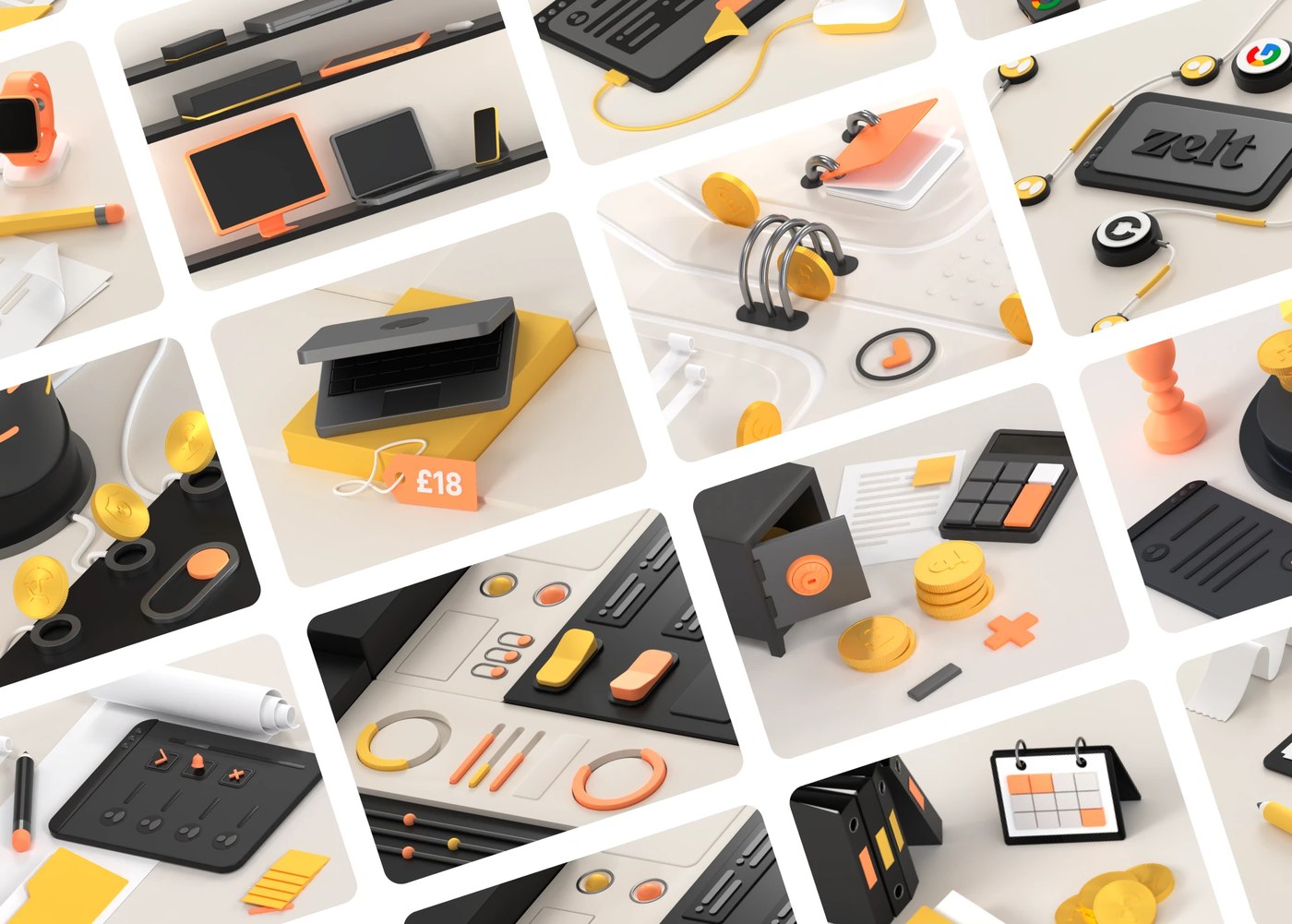
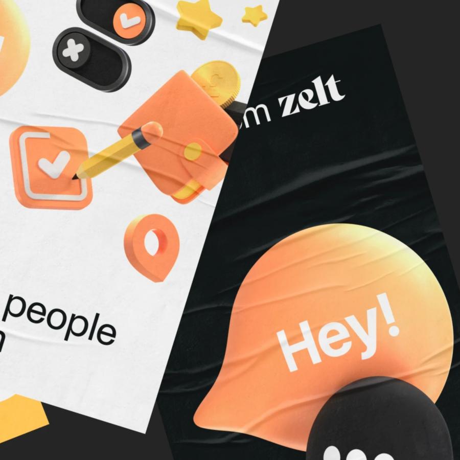
Beyond static screens, the project brings web design to life through tactile details and fluid motion. Six accompanying films document smooth scroll pacing, interactive pill toggles, and kinetic badge transitions. Instead of flat stock icons, Cuberto built custom 3D isometric objects. These include spiral ring binders, brass coins, puzzle blocks, and physical safe vaults. Playful details like team badge stickers bring warmth to onboarding. The tactile objects soften the feel of daily routines. Smooth easing curves and spring-loaded toggles guide users through complex tasks. As a result, the web design stays quick, tactile, and clear on desktop and mobile screens.
See more from Cuberto on Behance.